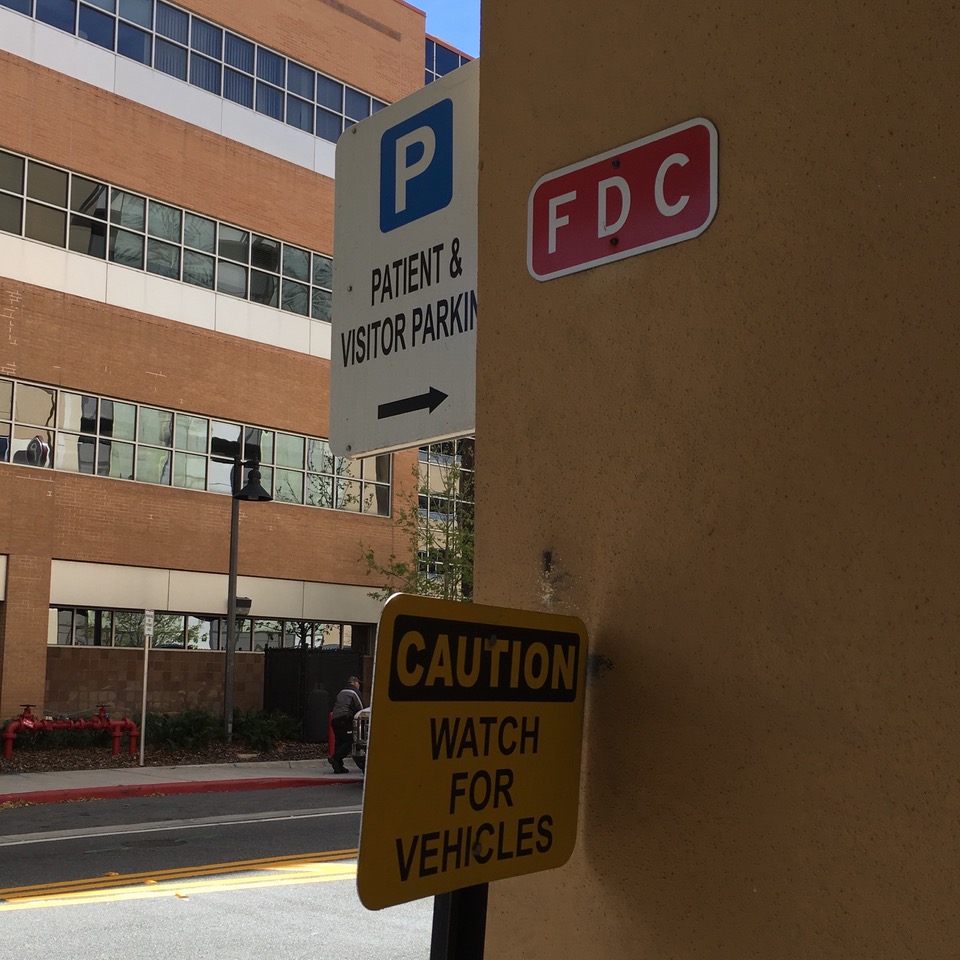
“Healthcare facilities use wayfinding like a drunk uses a lamppost: for support, not illumination," Mark VanderKlipp, partner, Connect_Cx told me last week when we met at the Beryl PX Conference.
What he means is that if they are designed as part of a comprehensive communications platform, wayfinding tools can be used to effectively support the entire patient experience.
Mark also said that the least tangible elements of the experience are the most important -- the interactions that surround the elements designed for wayfinding in healthcare facilities. He should know. Mark and his partners have many years of designing wayfinding systems for all types of facilities.
They aren't architects or interior designers, either.
They are human-centered design consultants with backgrounds in graphic design, industrial design, and systems design. And their company, Connect_Cx, is focused on building continuity across the entire range of communications.
So, I asked them what are the most common myths of wayfinding in healthcare facilities. Here's what Mark, Yvette Fevurly, and the team at Connect_CX came up with.
Myth #1. A Sign Fixes the Problem; or More Signs = Better Wayfinding
Signage seems like a logical solution if people are getting lost, but it's important to think about the lack of information that caused people to actually be lost. How might they have been better supported by information?
Also, if a sign will fix the problem, beware of engaging the company that’s making money off signs to solve wayfinding problems. Sign companies will always be happy to sell more signs, which does not necessarily benefit patients.
The best solutions incorporate fewer, better tools for wayfinding in healthcare facilities. The goal is to say less so people understand more.
And just because you have an in-house sign shop/graphic designer to support the program doesn't mean you’re developing effective wayfinding tools.
Myth #2. "Intuitive" Architectural Cues Are Understood by Everyone
Architects, interior designers, and space planners often say, “We do wayfinding.” And while architectural and interior design cues can be an important part of a comprehensive wayfinding solution, they will not be understood unless explicitly pointed out by someone who knows.
An example is a forest mural that serves as a landmark for people moving along a long corridor. Good landmarks have four characteristics: they need to be visible, “speakable,” memorable, and unique in the facility.
Myth #3. Color Coding Works for Everyone
Planning for those who are colorblind is critical. Wayfinding works best when multiple cues are incorporated, including icons, audible signals, cardinal directions (N, S, E, W) -- even smells, like when you know when you're close to the coffee shop.
Myth #4. Mobile Apps Fix Wayfinding Problems
The latest shiny new thing is not going to be a silver bullet for wayfinding. In fact, there are no silver bullets, but there may be silver buckshot: multiple tools, using consistent language and coding, leveraged across both built and virtual environments.
This is how to build a wayfinding system that supports experiences.
Myth #5. The Patient Experience Starts When People Get Here
Clearly, interactions begin well before the patient and family arrive at a healthcare facility. There are multiple ways that people can get lost, and each one of them is the direct result of a lack of communication or poorly planned communication.
This is the communication design challenge. Because relying only on signage to help people find their way misses many other opportunities to connect with them and provide helpful information prior to their arrival.
Myth #6. Wayfinding is Marketing
Internal departments often believe it’s necessary to appear on exterior signage, or on the building itself to serve as a marketing function. At best, this can overwhelm people approaching the facility with too much information. At worst, it can confuse them about the actual location of the internal destination.
An example is a facility when a children’s clinic in partnership with a national brand insisted that a sign be on the building exterior, visible from the adjacent highway.
Families with sick children came to that building, assuming that the destination was there. In fact, it was a half-mile walk away.
Myth #7. Everyone Understands "Medical-Speak"
The healthcare industry is full of acronyms and long medical jargon. One facility referred to its “Special Procedures Area” for outpatient procedures as “The SPA.”
When people came in for a colonoscopy, they were told that they needed to go to the spa. More than a little confusing, don't you think?
Myth #8. If We Work Hard Enough, We Can Fix This Problem
Just like you can’t read the label from inside the jar, you can't expect to be able to see what is creating your wayfinding issues while you're immersed in them. An outside consultant with expertise in all media (print, verbal, digital) and the design of the physical environment can correctly diagnose the issues based on observations and experience.
Most healthcare organizations have spent decades creating disconnected solutions in their facilities. Which is why a comprehensive communications approach to wayfinding is the best approach.
Myth #9. Wayfinding is a Single Project
Because there are so many ways that people can get lost, wayfinding is an evolutionary problem, requiring an evolutionary partner. Someone who can learn from internal staff and patients, develop hypotheses, test solutions, and refine solutions before developing the finished tools for wayfinding.
The solutions may already exist within the organization's culture and need to be revealed from within rather than imposed from outside.
Myth #10. Wayfinding is Someone Else’s Problem
People will assume staff members know how to help them. But, if staff members don't know how to use various wayfinding tools, they will be much less effective than if they were part of a comprehensive solution.
Training staff members to use the tools and speak consistently about wayfinding provides clarity to those who arrive at a healthcare facility under stress and need support. Teach staff to use the tools, and they’ll be empowered to help others navigate.
P.S. Please do me a favor -- if you liked this post and like this blog, please share it with others by sending them the link or posting it on your Twitter, LinkedIn, or Facebook. Also, don't forget to subscribe, so you'll get emails when new content is posted. Thanks!


