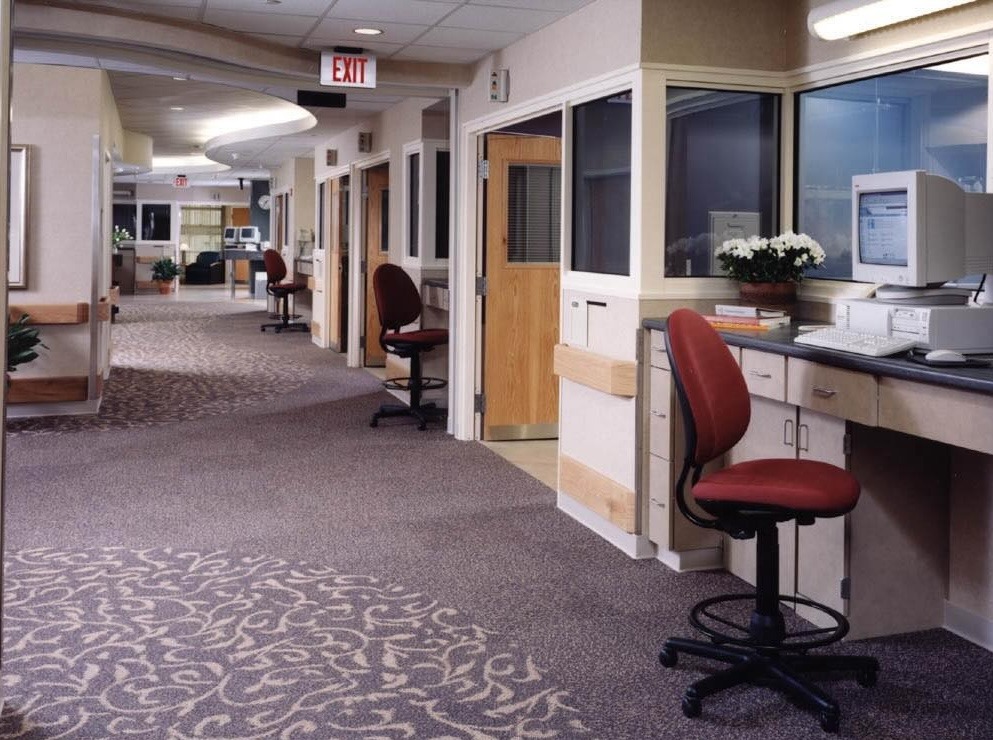
A replacement facility for the Rehabilitation Institute (RIC) of Chicago designed by HDR Architecture, Gensler, and Clive Wilkinson Architects; this is a rehab hospital unlike no other -- in both design and medical practice. By embedding clinical and research teams among patients 24/7, research is going to be applied directly during patient care.
This practice of "translational medicine" drove the design of this vertical building in the heart of Chicago's medical "district" in-between Lake Shore Drive and North Michigan Avenue.
But let's get back to the color.
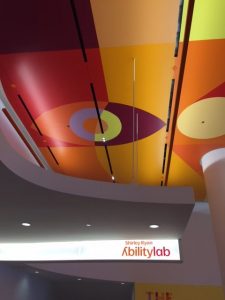
My photos don't do it justice, but interior designers will probably cringe at its mostly white background. However, they will love the bold colors on the floors, ceilings, and accent walls. And the abundance of natural light and spectacular views of the surrounding city and lake.
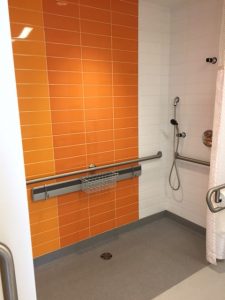
Which is good for a rehab hospital, I guess, since orange is thought to be associated with "meanings of joy, warmth, heat, sunshine, enthusiasm, creativity, success, encouragement, change, determination, health, stimulation, happiness, fun, enjoyment, balance, sexuality, freedom, expression, and fascination. (Source: Bourn Creative)
Joanne C. Smith, MD, RIC's President & Chief Executive Officer told me that the color palette is one of the major ways that the building itself conveys ability. "Bright colors and light pervade everything," she said, adding that these elements help incite energy and healing.

Contrast that to the Legs and Walking Ability Lab (right), which is a big open space with bold colors, lots of equipment, and no sound dampeners. Because movement and noise creates energy, which patients need to regain mobility.
Overall, the building design is very modern and clinical, which, with the white background, could feel cold and stark. But I think it works here.
Patients and staff are going to feel good in this facility.
P.S. Please do me a favor -- if you liked this post and like this blog, please share it with others by sending them the link and/or post it on your Twitter, LinkedIn, or Facebook, etc. Also, don't forget to subscribe so you'll get emails when new content is posted. Thanks!


